In the current competitive online landscape, drawing potential customers to your website is not the major issue. The major issue is:
How many visitors are actually taking action?
Whether it is signing up for a free trial, booking a consultation, downloading your guide or even buying a product, conversion is where it all begins, and will be the driver of your business growth. This is where landing page optimization (LPO) comes into play. Landing page optimization can literally double or triple your conversions using the same ads, at no extra cost to you.
You’ll discover in this blog:
What is landing page optimization is Why is Landing page optimization important? Best practices to triple your conversions. Things to look out for: Landing page optimization, Actionable steps to start today
What is landing page optimization
Landing page optimization (LPO) is the systematic approach of optimizing all of the vital components on a landing page to improve the percentage of visitors who will perform an action that’s desired action. It can be filling out a form, signing up for a webinar, downloading an eBook, or making a purchase in an online store; importantly, LPO works at optimizing the conversion from the traffic you are already obtaining. Many companies that have been investing in acquiring traffic to their web pages – via paid advertising, or SEO – completely miss that traffic without the element of conversions is all wasted money! Landing page optimization solves this issue by ensuring that your landing pages are more than visually appealing – they work at getting visitors to convert.
Why is Landing Page Optimization crucial?
Let’s take an example; you spend ₹10,000 on advertisements and get 1,000 people to your landing page. If your page has a conversion at 5%, that is 50 leads. Landing page optimization can increase your conversion to 10%, you just got 100 leads when you still spent the same ₹10,000. That is doubled the results, no additional ad spend.
Landing Page Optimization:
- Increases the ROI of Marketing Expenses
By simply converting more, you gain clearer leads or paying customers with less in marketing expenses! More money in your pocket. - Improves User Experience
An optimized landing page is organized, concise, easy to use, and creates a pathway to what action you want them to take next. It also improves their overall experience with your brand. - Builds Trust and Credibility
A smartly designed and professionally built landing page also establishes a sense of trust with the visitor, particularly at this stage, where they are about to input information to engage with your brand. - Reduces Cost Per Acquisition (CPA)
- Improves Brand Perception.
Best Practices to Double Your Conversions
1. Write an eye-catching headline
The headline is the first content visitors encounter. It will ultimately dictate whether someone chooses to stay and read on, or if they leave on principle. How to craft a solid headline:
Be clear, don’t be clever. Don’t try to use more sophisticated language and puns that will mislead visitors. Specific benefit. Show the visitor what they are getting from the offer. Be short. When writing a headline, you should be aiming for 10-12 words ideally. Examples: Weak: “Welcome to our Awesome Platform”
Strong: “Save 3 hours per day with our social media scheduler, plus more”
2. Make Attention-Grabbing Subheadlines. The subheadlines are your friend; the main headline gives your offering more specificity. Sub headline best practices are:
Deepen the promise made in the headline. Hit on the user’s pain point or desire. Keep it short and sharp. Example:If your headline is: “Double Your Website Traffic in 40 Days”,
Your sub headline can be: “Discover the exact SEO strategies we used to grow from 10,000 to 20,000 visitors per month – without spending a penny on ads.”
3. Use Benefit-Oriented, Persuasive Copy
Please note that landing pages often misfire – there is a lack of focus on benefits at the cost of features. The copy must explain to the visitor how your product or service will help solve their problems and how their lives will benefit after using your product or service.
When writing the copy, keep these ideas in mind:
Use “you” language, not “we” language.
Focus on outcomes and results.
Use bullet points to communicate information better.
Keep the sentences short to help with flow when reading.
Example:
Feature: “Our app has automated scheduling”.
Benefit: “By automating your posts, you can save an hour a week!”.
4. Add High-Quality Visuals or Videos
Visuals are processed tremendously faster than text. A suitable image, or explainer video, can drastically inform and build trust. Visual best practices:
Use actual images or authentic stock photos that relate to your offer. Use a short explainer video (less than 2 minutes) that shows what the product/service is. Do not use messy photos, or photos that are not directly related to your offer. For instance: For a fitness program offering, share a transformation image or a short clip of the workouts in the program.
5. Provide a Clear and Specific Call-to-Action (CTA) The CTA should indicate to your visitors what you would like them to do next. A vague “Submit” button will probably not spur action. Call to action best practices:
Make the text clear and actionable. Make benefits in the CTA very clear. Use contrasting colors to help it stand out. Examples:Poor: “Click Here”
Great: “Get My Free SEO Audit Now”
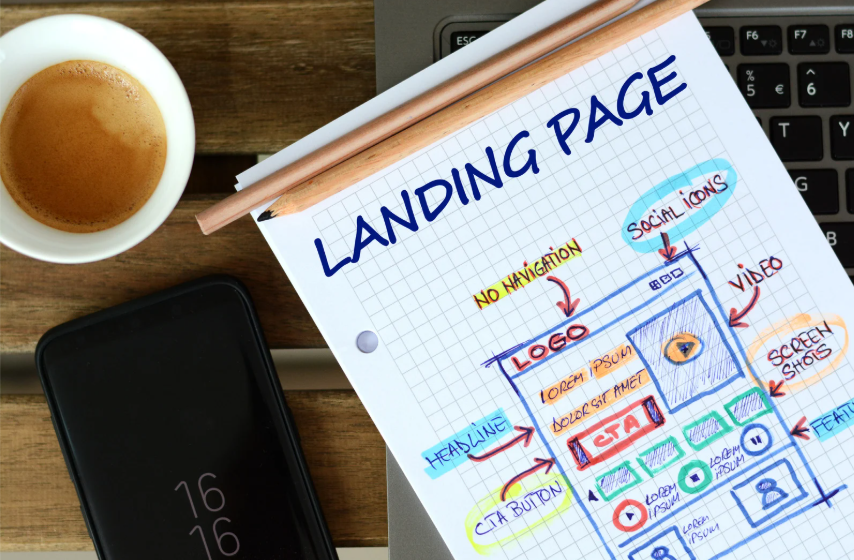
6. Reduce distractions A landing page should clearly represent one action. Too many links, menus, and offers confuse the visitor’s action in completing the task. Ways to reduce distractions:
Remove top navigation menus. Limit external links or footer links. Avoid too many different CTAs on the same page.Your page should direct the visitor easily to one action without any distractions or confusion.
7. Mobile Responsiveness Given the fact that more than seventy percent of users are browsing on mobile devices, your landing page must be responsive to mobile devices. Mobile Optimization Tips
Ensure the page has as fast load time (3 seconds or less!) Use large font that are easy to read Keep any mobile forms or other interactive elements short so that they can be filled out and easily scrolled on a phone. Make sure any CTA buttons are large enough to tap with your finger.
8. Leverage Social Proof to Establish Trust Humans are social beings who automatically conform to those around them. Especially when thinking about modifying behavior. We call this social proof. Ways to add social proof effectively:
Add testimonials that include names and photos. Add reviews or ratings if available. Add trust badges or logos from reputable clients or media appearance. Example: “Trusted by 500+ businesses, including [Client Logos].”
9. Use Fewer Form Fields The more fields in your form, the more friction you create. Only ask for information that is absolutely needed at that step. Form optimization steps:
For example, for a free guide you only need to ask for name and email. If you need more information then use multi-step forms (asking for basic information first, and then follow up for the additional detail)
Studies have shown single long forms result in lower completions than multi-step forms.
10.Testing (A/B Testing) You will not know what to A/B test for your iterations no matter how great your page is, until you do this first.
Some simple advice for an awesome A/B test:
You can only test 1 variable per test (this could be your headline, your text to CTA, your image, etc.).
Use a tool like Google Optimize, Unbounce, or VWO.
Continue your tests until you reach statistical significance.
Make adjustments based on empirics, not hypotheticals.
Optimizations are not a one and done; optimizations are forever.
Common Mistakes to avoid in Optimize Your Landing Page

Everyone, including top marketers and designers, can easily miss these common mistakes that drastically lower conversion rates. Landing Page Optimization is a crucial point, Here are details of how to avoid them:
1. Page Load Speeds (more than 70% of visitors leave if the page takes more than 5 seconds)
Why it occurs?
Large images, video that are not optimized, unwanted scripts or third-party Java Script integrations, or landing page code that has unnecessarily complicated coding will all compromise loading speed. Many marketers will focus more on the visual aesthetic of their landing page that loading speeds. It is a big point many miss in Landing page optimization.
Why it is detrimental: Studies show that if your page takes longer than 3 seconds to load, that can mean losing more than 50% of your visitors in an instance, potentially more on mobile devices. This only adds to your overall bounce rate and earns you a wasted cost on your paid traffic. How to avoid this mistake:
• Compress your images to decrease quality to weight ratio
• Use fast, reliable hosting
• Pause or delete plugins
• Check page speed for your landing page using Google PageSpeed Insights or GTMetrix.
2. Deceptive Headlines That Don’t Reflect Your Offer
Why does it happen: Sometimes marketers just want the catchy headline for attention – but the content or offer on the page does not fulfil the headline promise. Why is it bad: Mistrust and disappointment are created. Visitors feel tricked and leave, never take any action afterwards. It would also increase your cost per lead when visitors bounce back without converting. How to fix it: Prove your headline reflects what you are offering
Don’t click-bait Follow through with your headline – this is how you build trust.
3. Weak CTAs of “Click Here” with No Purpose
Why this exists: A generic CTA, such as “Click Here” or “Submit” are still commonly found but don’t offer any clarity on what the user will actually receive.
Why this is bad: If you don’t clearly tell your visitor what happens next, or what benefit they are going to receive, visitors will end up hesitating or ignoring it completely.
How to resolve it: Make it a clear, specific and benefit focused CTA
Example: You can use “Get My Free Quote” or “Download My Free Guide” instead of “Submit”.
4. Overly Complicated Forms containing Unnecessary Questions
Why this Occurred: Many businesses seek to gather as much data as possible in a single request. In this mindset, they obtain more details than needed during the initial request. Why it’s Bad: Long or complicated forms create friction and overwhelm, resulting in abandonment. Visitors do not want to invest excessive time and share their personal details anyway, if they didn’t have to. Fix: Ask for only pertinent information
Reduce the overall number of fields on the form to be as low as necessary
If the form requires additional details, use multi-step forms where the user must give the least amount of information first and gradually request additional information.
5. Failing to Analyze and Test
Why do we do this: Too often marketers are onto the next campaign, once a page has been published there is no reason to see how its performing, – only thinking about more new campaigns and traffic. Why this is bad: If you’re not testing and analyzing the data, you’ll never know what works or what even could work better. It’s an opportunity missed at making good data-driven decisions to improve conversions. Solution: check the analytics on regular intervals .
Conduct (A/B) testing
You may use insights to continue improving.
6. Using Bad Images or Videos
What happened: Sometimes marketers use unrelated, or low-quality images or videos because they don’t want to spend any time or money looking for related assets, and they don’t relate to the brand or offer being presented. Why is it bad: Using low-quality images results in an unprofessional brand, and decreases trust so potential visitors become discerning of your credibility. How to fix this: Use authentic images related to your product or service, and of course they should be decent quality . Use stock photos that appear natural and authentic
Use short, clear, professionally edited videos so you can maintain attention
Final Thought: Incremental Changes Yield Big Results
Many marketers consider altering a marketing strategy to double conversions to be a fresh new site or campaign at worst, or a costly revamp at least. More often than, improvements with direction and strategy that bring the results. Changing one word of your homepage headline can help to better reflect your visitor’s core desire and your page’s use for them can increase conversions by 10% – 20%! Simply making your call to action clearer and improve the benefit intention can add clicks without changing anything else! Reducing image sizes to reduce loading time- to be a even second or less- reduced bounce rates enormously, ensuring visitors remained! Simply by creating a genuine, high quality image representing your product/ customer instead of a generic stock image, you too can develop instant trust! Adding one powerful, authentic testimonial from a real client could put the final touch on a on-the-fence-by decision to action!


